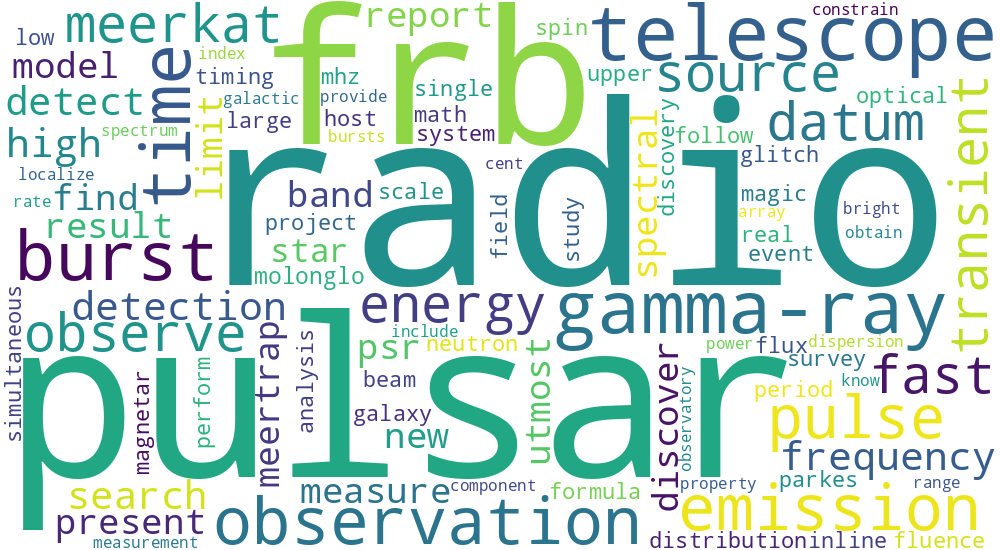
I generated a word cloud visualisation from my publication data on NASA ADS.
I did that using the excellent Python package wordcloud. However, it required a decent amount of data pre-processing and experimentation with the word cloud parameters. Please find the finished image below.
The font size of the words is roughly proportional to the frequency (counts) they are mentioned in my publications. It is interesting for objectively assessing how important a given topic is in my research. Of course, other weightings (e.g. by citation number) would also be interesting to see.
